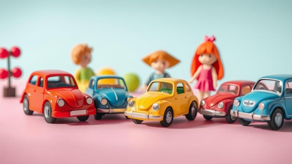
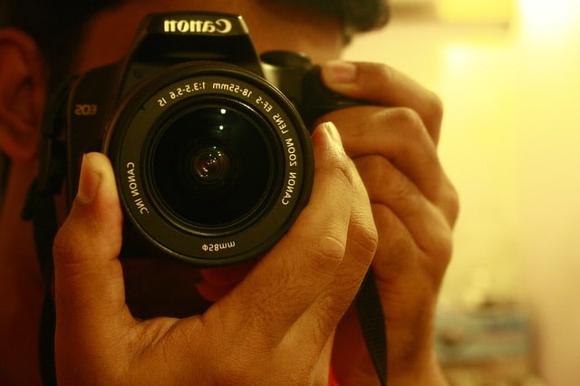
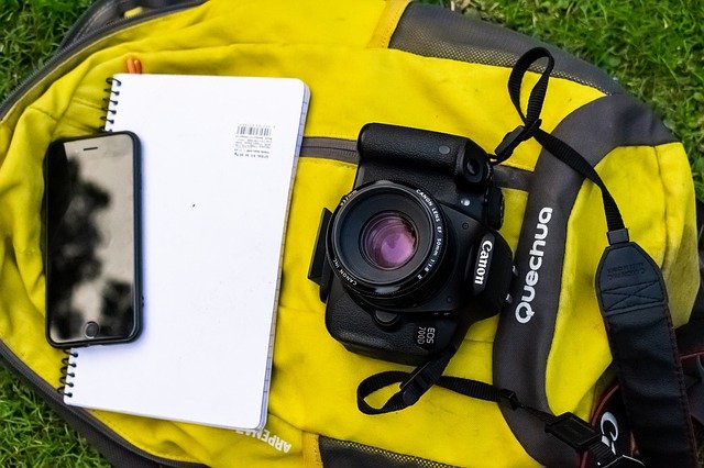
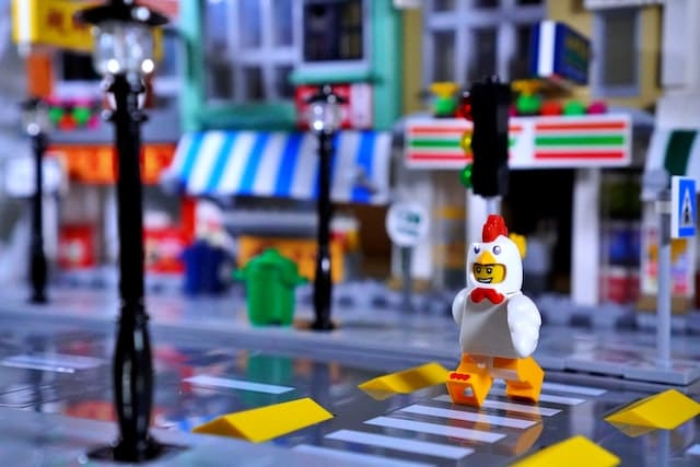
Enhancing toy photos with color harmony techniques brings balance and visual appeal to your shots. Start by considering how toy colors interact with their background. Use complementary colors for a dynamic effect and to highlight focal points. Analogous colors can create serene scenes, while triadic combinations offer playful energy. Split-complementary schemes add depth without overwhelming the viewer. A well-chosen color palette not only enhances mood but also guides the viewer's eye to key elements. Experiment with different schemes like vibrant backdrops or monochromatic sets to convey emotions. Explore these techniques to master the art of enchanting toy photography.
Understanding Color Harmony
Understanding color harmony is essential when capturing toy photos that are visually appealing and balanced. When you grasp the basics of color harmony, you can transform an ordinary toy photo into something extraordinary. Start by considering how colors interact with each other. Think about the colors of the toys and how they complement or contrast with the background and any other elements in the scene.
One effective approach is to use complementary colors. These are colors opposite each other on the color wheel, like blue and orange or red and green. When placed together, they create vibrant energy and help your subject stand out. Alternatively, you can explore analogous colors, which are next to each other on the wheel, such as blue, green, and teal. This creates a more subtle and unified look.
Don't forget about the emotional impact colors can have. Warm colors like red and yellow can evoke excitement, while cool colors like blue and green can convey calmness. By understanding these dynamics, you can align your photo's mood with the intended message. Experiment with different combinations and pay attention to how they affect the final image.
The Role of Color Theory
Applying color theory in toy photography can drastically enhance the visual appeal of your images. By understanding the relationships between colors, you can create compositions that draw the viewer’s eye and evoke specific emotions. Color theory helps you decide how to use colors effectively to make your toy photos stand out. For instance, complementary colors can create a striking contrast that highlights the subjects and adds depth to the composition. Additionally, using analogous colors can establish harmony and a cohesive feel that makes the scene more inviting. By incorporating color theory in toy photography, you not only elevate the aesthetic quality of your work but also communicate a narrative that resonates with your audience.
Here's how you can leverage color theory:
- Create Visual Balance: Use complementary colors to achieve a balanced and harmonious look. When you place colors opposite each other on the color spectrum, they create a striking contrast that can make your photos more dynamic.
- Convey Mood: Different colors evoke different emotions. Warm colors like red and yellow can create excitement and warmth, while cool colors like blue and green can convey calmness and serenity. Choose your color palette based on the mood you want to express.
- Highlight Focus: Use color to draw attention to the main subject of your photo. By selecting a dominant color for your toy and contrasting it with the background, you can guide the viewer's eye directly to the focal point.
The Color Wheel Basics
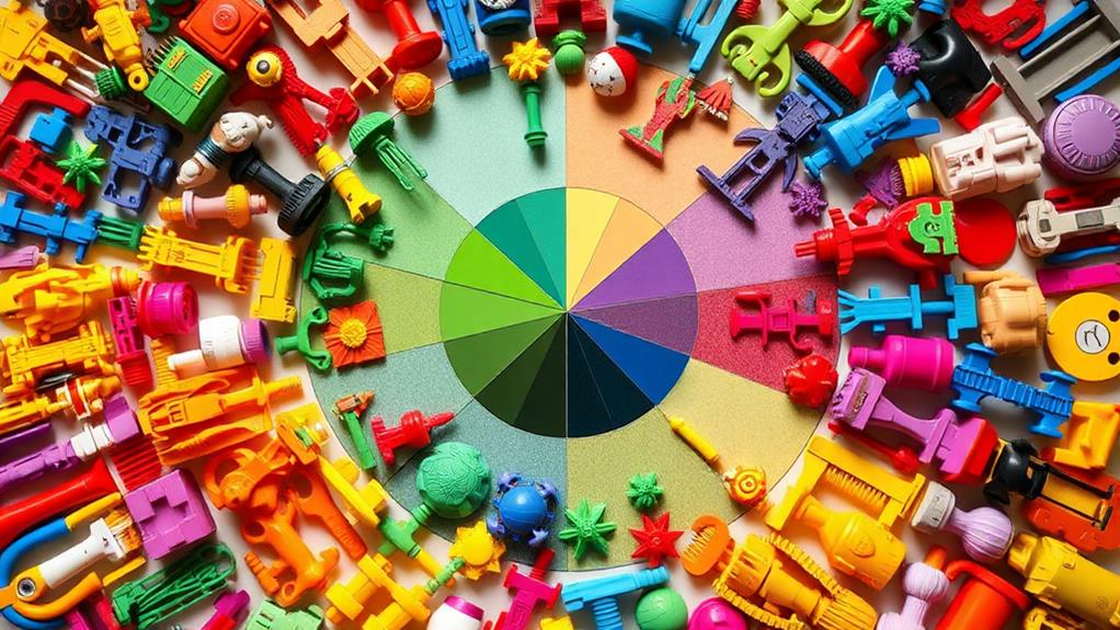
A color wheel is a fundamental tool in your photography toolkit, helping you make informed decisions about color combinations in your toy photos. It visually represents colors arranged in a circle, showing the relationships between primary, secondary, and tertiary colors. Understanding this tool enables you to create visually appealing images that captivate viewers' attention.
You start with the primary colors: red, blue, and yellow. These are the foundation, as they can't be created by mixing other colors. By combining primary colors, you get secondary colors: green, orange, and purple. For instance, mixing blue and yellow gives you green. Each secondary color sits between the two primary colors it's derived from on the wheel.
Tertiary colors are formed by mixing primary and secondary colors. You'll find shades like red-orange and blue-green here. The wheel helps you see these shifts and understand how colors relate to each other.
Using the color wheel, you can experiment with various color harmonies in your toy photography. By knowing which colors complement or contrast with each other, you can make your toy photos more vibrant and engaging. It's all about effectively using color to enhance the visual impact of your work.
Complementary Color Schemes
When it comes to creating striking toy photos, complementary color schemes offer a powerful tool for grabbing attention. These schemes involve pairing colors opposite each other on the color wheel, such as red and green or blue and orange. Using these contrasting colors together can make your toy photos pop and create a vibrant, dynamic look that draws viewers in.
To effectively use complementary color schemes in your toy photography, consider the following tips:
- Choose Your Main Color: Start by selecting the primary color of your toy. This will be your anchor, helping you decide on the complementary hue. If your toy is mainly blue, look to orange for the complementary touch.
- Balance the Colors: Too much of both colors can feel overwhelming. Aim for a 70/30 balance, where the dominant color covers most of the scene, and the complementary color accents it. This balance maintains visual interest without chaos.
- Use Backgrounds and Props: Incorporate complementary colors through backgrounds or props. A red toy on a green background, or vice versa, can create a striking image. Experiment with colored lights or filters to enhance this effect without needing additional physical elements.
These strategies will help you craft compelling, attention-grabbing toy photos.
Analogous Color Approaches
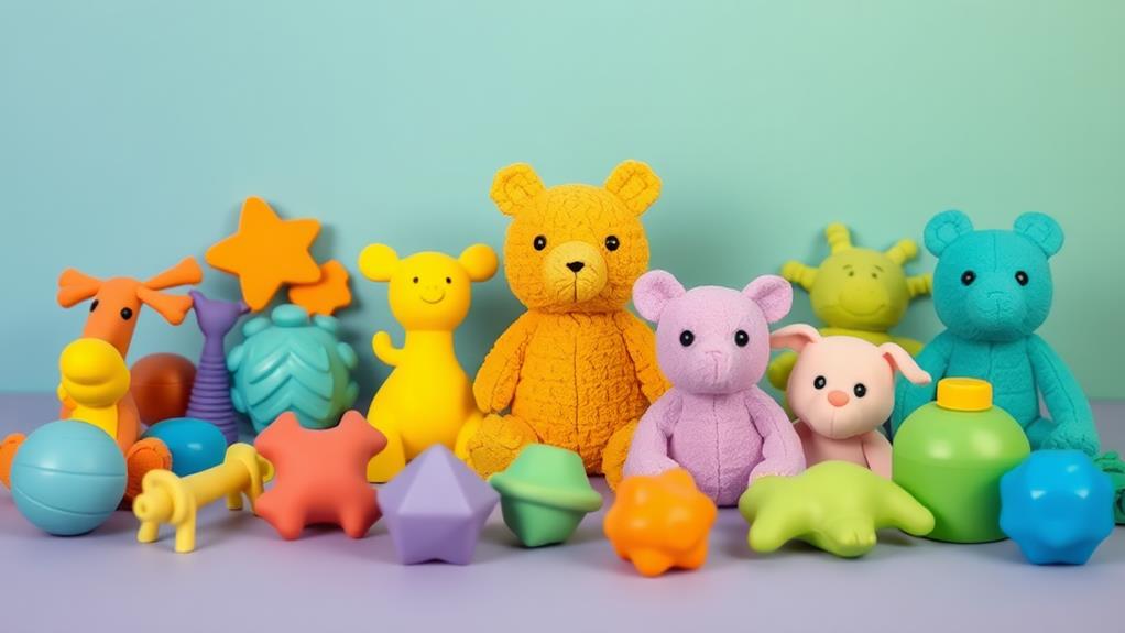
For a harmonious and soothing effect in your toy photography, consider using analogous color schemes. These involve selecting colors that sit next to each other on the color wheel, such as blues, teals, and greens, or reds, oranges, and yellows. By choosing colors that naturally blend, you create a sense of unity and flow in your images.
Start by picking a dominant color for your toy or background. Then, select two or three adjacent colors to complement your primary choice. This approach works well to highlight specific features of your toy, such as a superhero's costume or a doll's vibrant outfit, by surrounding them with harmonious hues.
When setting up your scene, think about the mood you'd like to convey. Analogous colors often evoke feelings of calm and tranquility, perfect for a serene landscape or a cozy indoor setting. Adjust your lighting to enhance these colors, ensuring they're soft and unobtrusive.
Experiment with saturation and brightness to see how these colors interact. Sometimes, subtle variations can add depth and interest. Remember, the goal is to create a balanced composition that draws the viewer's eye naturally from one element to the next.
Triadic Color Combinations
While analogous color schemes offer a serene and unified feel, triadic color combinations bring a dynamic and vibrant energy to your toy photography. By using three evenly spaced colors on the color wheel, you create a balanced visual contrast that makes your images pop. Triadic schemes are perfect for capturing the playful essence of toys, adding an extra layer of excitement to your photo compositions.
To implement a triadic color scheme, start by selecting a primary color for your subject or background. Then, find two more colors that are evenly spaced around the color wheel. This approach guarantees harmony while providing enough contrast to grab attention. Here's how you can apply triadic color combinations effectively:
- Choose a Dominant Color: Start with one color as your main focus, setting the tone for the entire image. This color should be bold and eye-catching to draw viewers in.
- Add Supporting Colors: Use the other two colors to complement the dominant hue. These colors can be used for background elements or to highlight specific toy details.
- Balance the Colors: Confirm each color has its place without overpowering the others, achieving a cohesive and lively composition.
Applying Split-Complementary Colors
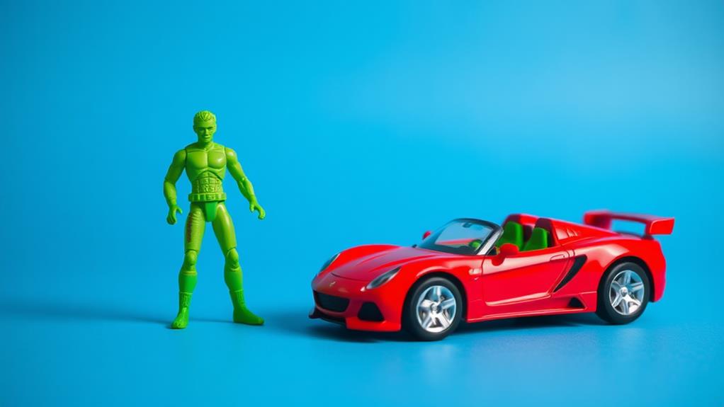
Split-complementary colors offer a subtle yet striking way to enhance your toy photography. By using this color scheme, you choose one base color and two adjacent colors from its complementary counterpart on the color wheel. This approach provides a balanced yet dynamic look, avoiding the intensity of direct complementary colors while still providing contrast.
Start by selecting a primary color for your toy, such as blue. Then, identify the complementary color, orange, and choose the two colors next to it, like yellow-orange and red-orange. This palette creates a vibrant backdrop that won't overshadow your main subject. For instance, if you're photographing a blue action figure, use props or backgrounds in yellow-orange and red-orange to make the figure pop without overwhelming it.
To implement this technique effectively, adjust the saturation and brightness to suit the mood you want to convey. Keep the split-complementary colors in the background or accent elements to guarantee your toy remains the focal point. Experiment with different combinations and lighting setups to find what best highlights the unique features of your toys. With practice, you'll master split-complementary colors, adding a professional touch to your photos.
Creating Mood With Monochromatic Colors
When you want to evoke a specific mood in your toy photos, monochromatic colors can be a powerful tool. By using different shades, tints, and tones of a single color, you can create a cohesive and emotionally resonant image. Monochromatic schemes can simplify your composition, helping your subject stand out while conveying a particular atmosphere.
To effectively use monochromatic colors in your toy photography, consider the following steps:
- Choose Your Base Color: Decide what emotion you want to convey. Blue can evoke calmness, red can express energy, and green might symbolize growth or tranquility. Select a color that aligns with your desired mood.
- Play with Variations: Use lighter and darker shades of your chosen color to add depth and interest. This can be achieved through lighting adjustments or editing software. Variations keep the image dynamic while maintaining harmony.
- Focus on Texture: Since color variation is limited, pay attention to textures and patterns within the photo. They add an extra layer of visual interest, making the monochromatic scheme more engaging.
Frequently Asked Questions
How Can I Choose the Right Background for My Toy Photos?
Focus on your toy's colors and pick a background that complements or contrasts them. Choose a simple, uncluttered backdrop to keep attention on the toy. Experiment with textures and lighting to enhance the photo's mood and depth.
What Tools or Software Can Enhance Color Harmony in Photos?
Imagine wielding a painter's palette; Photoshop, Lightroom, and Canva become your brushes. These tools let you blend colors seamlessly, creating harmony like a symphony. They'll transform your photos into vibrant pieces that captivate and enchant.
Are There Specific Lighting Techniques for Vibrant Toy Photography?
You can make toy photos vibrant by using soft, diffused lighting to minimize harsh shadows. Experiment with backlighting for depth and colored gels for dynamic effects. Adjust your angles and distance to enhance the toy's features.
How Do Props Affect the Color Harmony in Toy Photos?
Props act like supporting actors, setting the stage for your toy photos. They can either harmonize with colors like a symphony or clash like a storm, so choose wisely to maintain a balanced, vibrant composition.
What Camera Settings Are Best for Capturing True Colors in Toy Photography?
You'll want to set your camera to shoot in RAW for flexibility. Adjust the white balance manually to suit the lighting. Use a low ISO to minimize noise and a neutral picture profile for accurate colors.
At a Glance
You've now released the magical world of color harmony, where your toy photos pop with an explosion of vibrant hues! By mastering color theory, you've fundamentally become a wizard of the color wheel. Complementary and analogous schemes are your new best buds, and triadic combos might as well be your secret weapon. With split-complementary and monochromatic palettes, you're crafting moods like a maestro. So go on, unleash your inner Picasso, and let your toy photos dazzle the world!

